A website for a small mountain tour agency
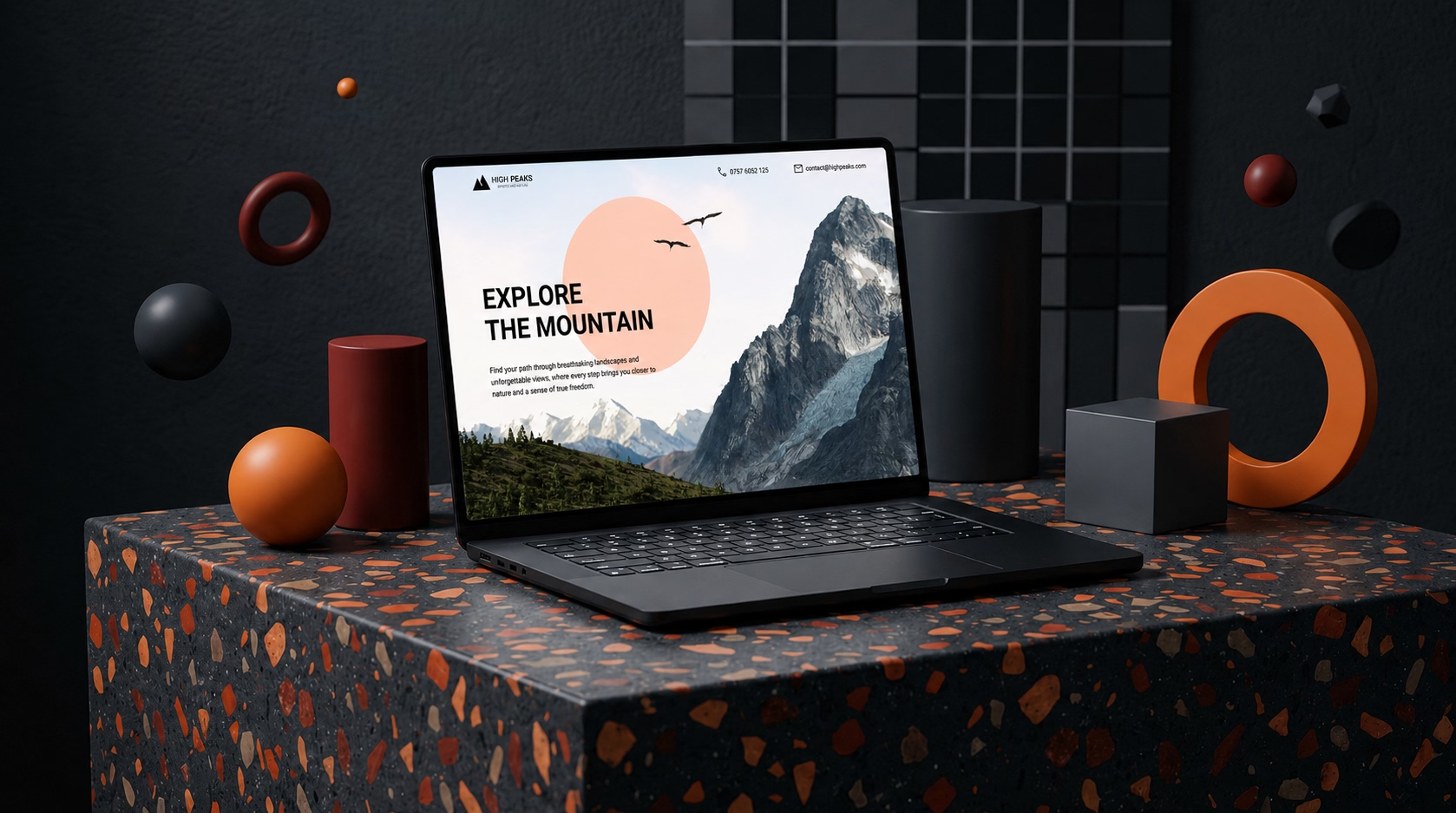
I designed and built a website for a small mountain tour agency that needed an online presence as compelling as the trips they run. The project focused on presenting guided tours and destinations in a way that gets visitors excited and moves them toward booking. Clean layout, strong imagery, and an intuitive structure make it easy for anyone landing on the site to find the right trip and take the next step.

Problems & solutions
The agency had great trips but no way to sell them online
A site built around discovery and booking
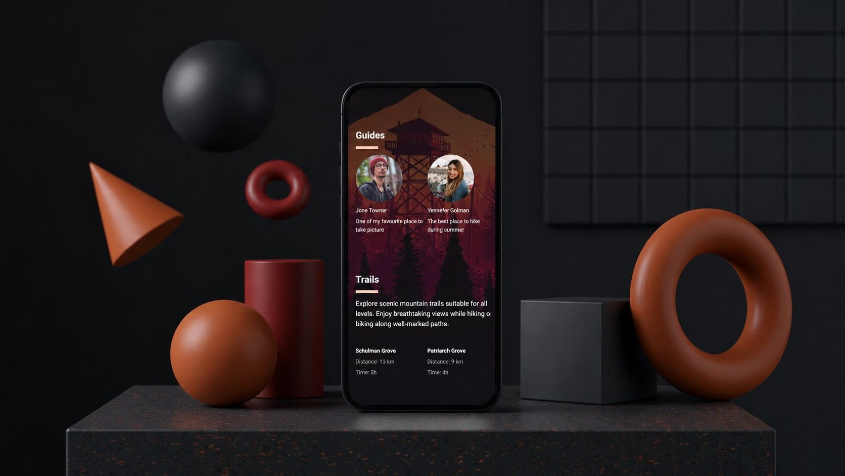
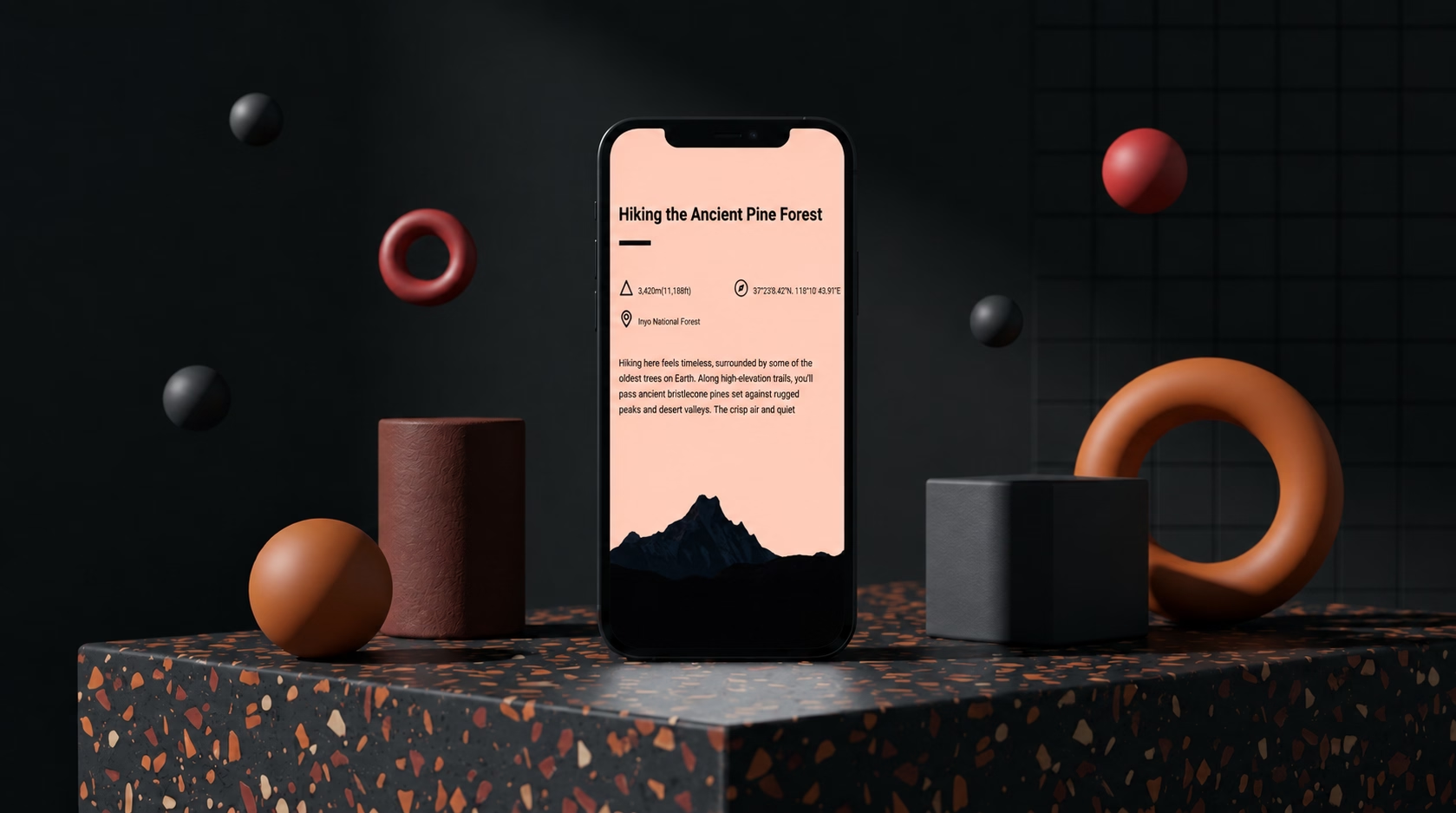
Tours were described poorly and destinations were not shown off
Destination pages that sell the experience
The booking process was unclear and put people off
A clear, low-friction path from interest to enquiry
What the tour agency needed from their website
The agency needed a site to attract new clients and convert them into bookings. They had the tours and the reputation - what they lacked was a platform that communicated both to a first-time visitor.
Design built around the way people choose a tour
Tour buyers come back more than once before committing. Clear descriptions answer practical questions. Visuals do the emotional selling. A simple enquiry form lowers the barrier to contact.
Results
New clients finding them without a recommendation
A stronger position when potential clients compare options
Content that keeps working after the initial build
Book a free 30-minute website call


Other Projects
Carpentry Business Website Design
A carpentry business needed a proper online presence to back up years of quality work. Clean project gallery, clear services, and built to show up in local search.
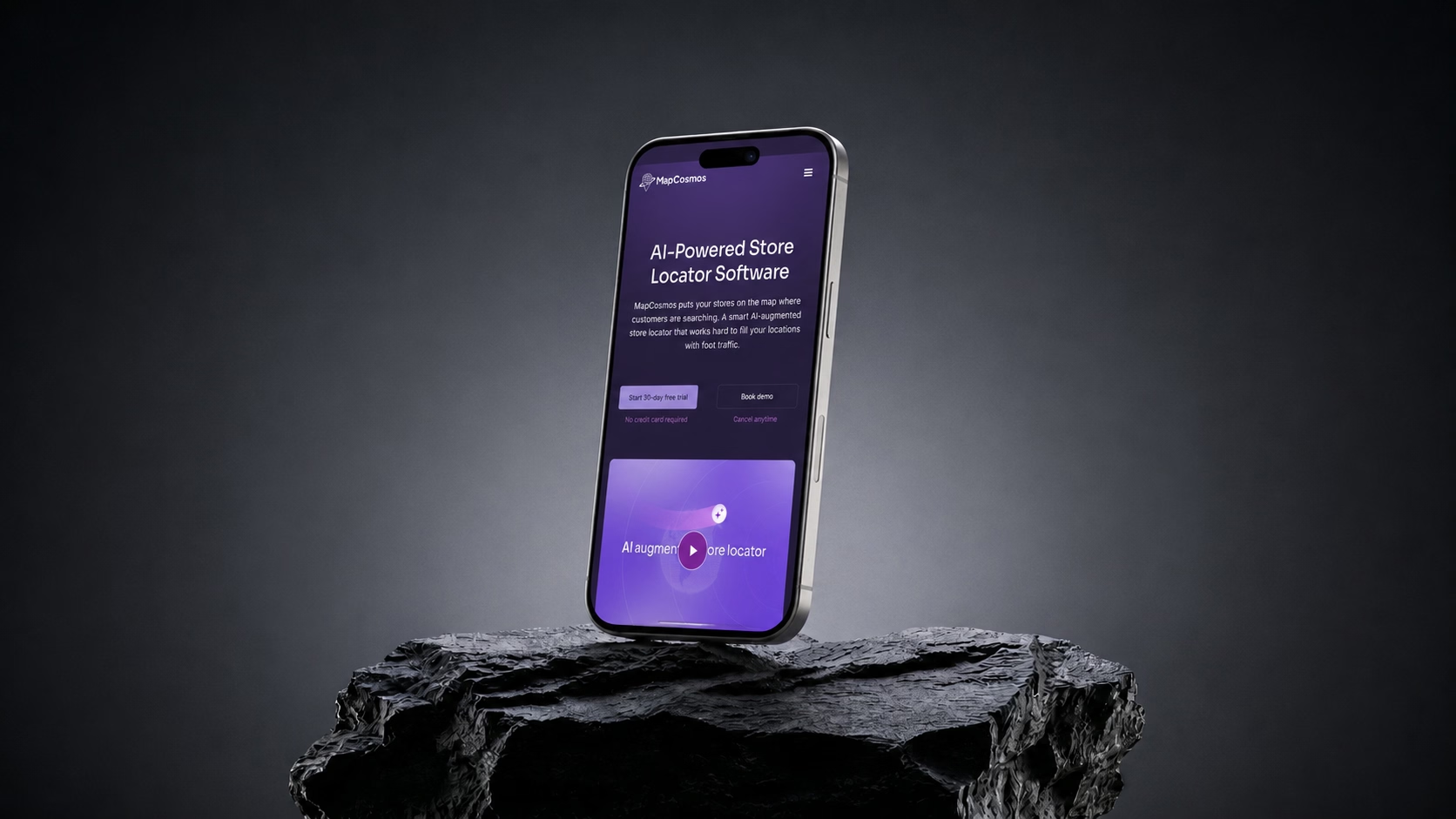
SaaS marketing website built in Webflow
A product marketing site for a store locator tool - interactive visuals, clean layout, and built in Webflow to convert visitors into customers.
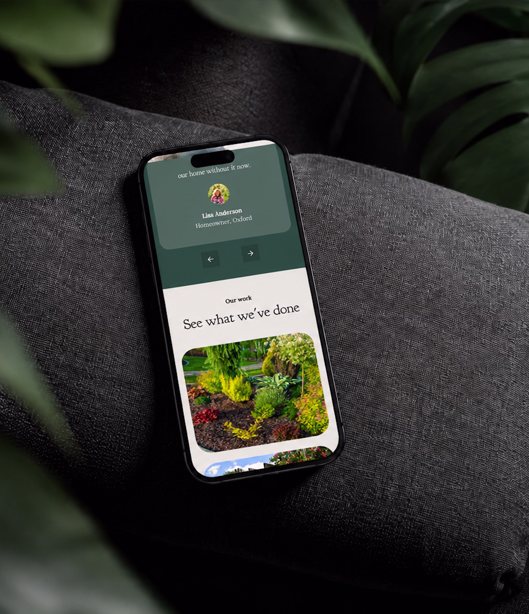
Gardening Service Website Design
A local gardening business needed a proper online presence. Service pages, a project gallery, and built to attract new clients through local search.
.png)